Examples

contour_boxplot_example

This example demonstrates the use of contour boxplots to visualize the variability in an ensemble of 2D scalar fields. It generates a synthetic ensemble of scalar fields with Gaussian blobs and visualizes the ensemble contours using spaghetti plots and contour boxplots.

import necessary libraries

from flask.config import T
import numpy as np
import matplotlib.pyplot as plt
from uvisbox.Modules.ContourBoxplot import contour_boxplot
from uvisbox.Core.CommonInterface import BoxplotStyleConfig
def create_ensemble_scalarfield(image_res=256, n_ensembles=30, sigma_min=5, sigma_max=50):
    #
    # Create an ensemble of 2D scalar fields with Gaussian blobs in the center.
    # Args:
    #     image_res (int): Resolution of the image (image_res x image_res).
    #     n_ensembles (int): Number of ensemble members.
    #     sigma_min (float): Minimum sigma for Gaussian.
    #     sigma_max (float): Maximum sigma for Gaussian.
    # Returns:
    #     np.ndarray: Array of shape (n_ensembles, image_res, image_res).
    #
    x = np.linspace(0, image_res-1, image_res)
    y = np.linspace(0, image_res-1, image_res)
    xx, yy = np.meshgrid(x, y)
    grid = np.stack([xx, yy], axis=-1)
    ensemble = []
    for i in range(n_ensembles):
        sigma = np.random.uniform(sigma_min, sigma_max)
        cov = np.array([[sigma**2, 0], [0, sigma**2]])
        mu = np.array([image_res/2, image_res/2])
        inv_cov = np.linalg.inv(cov)
        diff = grid - mu
        pdf = np.exp(-0.5 * np.sum(diff @ inv_cov * diff, axis=-1))
        # Normalize to [-1, 1]
        pdf = 2 * (pdf - np.min(pdf)) / (np.max(pdf) - np.min(pdf)) - 1
        ensemble.append(pdf)

    return np.array(ensemble)

Generate a synthetic ensemble of scalar fields and visualize using spaghetti

# Generate synthetic ensemble of scalar fields
ensemble = create_ensemble_scalarfield(image_res=256, n_ensembles=100, sigma_min=20, sigma_max=100)

# Visualize the ensemble contours using spaghetti
fig, ax = plt.subplots(1, 2, figsize=(10, 4), sharex=True, sharey=True)

# Spaghetti plot - show contours at isovalue = 0.7
for i in range(ensemble.shape[0]):
    ax[0].contour(ensemble[i], levels=[0.7], colors='black', linewidths=1, alpha=0.3)
ax[0].set_title("Ensemble Contours (Spaghetti Plot)")
ax[0].set_aspect('equal', adjustable='box')

Calculate and plot the contour boxplot using the new interface

style = BoxplotStyleConfig(
    percentiles=[25, 50, 75, 95],
    percentile_colormap='Oranges',  # Use magma colormap for visualization
    show_median=True,
    show_outliers=True
)
ax[1] = contour_boxplot(
    ensemble,
    isovalue=0.7,
    boxplot_style=style,
    ax=ax[1],
    workers=6
)
ax[1].set_title("Contour Boxplot")
ax[1].set_aspect('equal', adjustable='box')

plt.tight_layout()
plt.show()
Contour Boxplot Example
examples.contour_boxplot_example.create_ensemble_scalarfield(image_res=256, n_ensembles=30, sigma_min=5, sigma_max=50)[source]

Create an ensemble of 2D scalar fields with Gaussian blobs in the center. :param image_res: Resolution of the image (image_res x image_res). :type image_res: int :param n_ensembles: Number of ensemble members. :type n_ensembles: int :param sigma_min: Minimum sigma for Gaussian. :type sigma_min: float :param sigma_max: Maximum sigma for Gaussian. :type sigma_max: float

Returns:

Array of shape (n_ensembles, image_res, image_res).

Return type:

np.ndarray

curve_boxplot_example

This example demonstrates how to create a curve band depth plot using randomly generated curves. It generates synthetic curves by: 1. Creating a base smooth curve (sine wave) 2. Adding Y-direction shifts sampled from a Gaussian distribution 3. Adding slight random noise at each time step

This approach creates realistic curve ensembles where curves follow a similar pattern but with controlled variations, making the band depth analysis more meaningful.

Import necessary libraries

from scipy.__config__ import show
from uvisbox.Modules.CurveBoxplot import curve_boxplot
from uvisbox.Core.CommonInterface import BoxplotStyleConfig
import matplotlib.pyplot as plt
import numpy as np
# Set random seed for reproducibility
np.random.seed(42)

# Parameters for curve generation
n_curves = 50        # Number of curves (samples)
n_steps = 150        # Number of time steps
n_dims = 2           # 2D curves (x, y)

print("Curve Boxplot Example - Random Gaussian Curves")

# Generate base curve (the "true" curve that all samples are based on)
# This creates a smooth trajectory
t = np.linspace(0, 4 * np.pi, n_steps)
base_curve = np.zeros((n_steps, n_dims))
base_curve[:, 0] = t  # X increases linearly with time
base_curve[:, 1] = np.sin(t) * 2  # Y follows a sine wave

# Generate random curves by adding variations to the base curve
curves = np.zeros((n_curves, n_steps, n_dims))

print("=" * 70)
print("Generating random curves...")
print("=" * 70)

for curve_idx in range(n_curves):
    # Start with the base curve
    curve = base_curve.copy()

    # Add a global Y-direction shift sampled from Gaussian
    # This creates different "lanes" for each curve
    y_shift = np.random.normal(0, 0.5)
    curve[:, 1] += y_shift

    # Add slight randomness at each step
    # This creates local perturbations along the curve
    for step in range(n_steps):
        step_noise = np.random.normal(0, 0.15, n_dims)
        curve[step, :] += step_noise

    curves[curve_idx] = curve

print(f"Generated {n_curves} curves with {n_steps} time steps")
print(f"Base curve: smooth sine wave with random Y-shifts and local noise")
print(f"Curves shape: {curves.shape}")
# Create a figure with 2 subplots
fig, (ax1, ax2) = plt.subplots(1, 2, figsize=(14, 6))

# Left subplot: Plot all curves with base curve
print("Plotting all curves...")
ax1.plot(base_curve[:, 0], base_curve[:, 1], color='black',
        linewidth=2, label='Base Curve', zorder=10)

for curve in curves:
    ax1.plot(curve[:, 0], curve[:, 1], color='lightgray', alpha=0.5, linewidth=0.8)

ax1.set_title('All Generated Curves (50 curves)')
ax1.set_xlabel('X')
ax1.set_ylabel('Y')
ax1.legend(loc='best')
ax1.grid(True, alpha=0.3)

Right subplot: Use curve_boxplot to plot multiple percentile bands

print("Creating curve boxplot with multiple percentile bands...")

# Create custom styling configuration
style = BoxplotStyleConfig(
    percentiles=[90, 50, 25],
    percentile_colormap='viridis',  # Use viridis colormap for bands
    show_median=True,
    median_color='red',
    show_outliers=True
)

# Call the curve_boxplot function with the style configuration
curve_boxplot(curves, boxplot_style=style, ax=ax2)

ax2.set_title('Curve Band Depth Plot with Percentile Bands')
ax2.set_xlabel('X')
ax2.set_ylabel('Y')
ax2.legend(loc='best')
ax2.grid(True, alpha=0.3)

Add colorbar to show percentile mapping

import matplotlib.cm as cm
from matplotlib.colorbar import ColorbarBase
from matplotlib.colors import Normalize

# Adjust layout to make room for colorbar
plt.tight_layout(rect=[0, 0, 0.9, 1])

# Create a new axis for the colorbar
cbar_ax = fig.add_axes([0.92, 0.15, 0.02, 0.7])  # [left, bottom, width, height]
norm = Normalize(vmin=min(style.percentiles), vmax=max(style.percentiles))
cbar = ColorbarBase(cbar_ax, cmap=cm.get_cmap(style.percentile_colormap), norm=norm, orientation='vertical')
cbar.set_label('Percentile (%)', rotation=270, labelpad=20)

print("=" * 70)
print("Displaying plot...")
print("=" * 70)
plt.show()
Curve Boxplot Example

functional_boxplot_example

probabilistic_marching_cubes_example

This example demonstrates how to compute and visualize probabilistic isosurfaces using the marching cubes algorithm on a synthetic 4D dataset. It compares a deterministic isosurface with a probabilistic isosurface derived from an ensemble of scalar fields.

Import necessary libraries

import numpy as np
import pyvista as pv
from uvisbox.Modules.ProbabilisticMarchingCubes import probabilistic_marching_cubes

Generate a regular grid over a 3D domain [-1, 1] and use the tear drop function to create an ensemble of scalar fields with some noise

# tear drop function
def tear_drop(x, y, z):
    return 0.5*x**5 + 0.5*x**4 - y**2 - z**2

# Generate synthetic 4D data (n_z, n_y, n_x, n_ens)
n_x, n_y, n_z, n_ens = 30, 30, 30, 30
x = np.linspace(-1, 1, n_x)
y = np.linspace(-1, 1, n_y)
z = np.linspace(-1, 1, n_z)
X, Y, Z = np.meshgrid(x, y, z, indexing='ij')
# Create an ensemble of scalar fields with some noise
noise_less_F = tear_drop(X, Y, Z)
origin = (0, 0, 0)
spacing = (1, 1, 1)
grid_dimensions = (n_z, n_y, n_x)
grid = pv.ImageData(dimensions=grid_dimensions, origin=origin, spacing=spacing)
# Add some data to the cell data (e.g., a 4D NumPy array)
grid.point_data["values"] = noise_less_F.flatten(order='F')

# Set isovalue and compute deterministic isosurface
isovalue = 0
iso_surface = grid.contour([isovalue], scalars="values")
# Set up the plotter with two subplots
plotter = pv.Plotter(shape=(1, 2), off_screen=True)
# Plot deterministic isosurface
plotter.subplot(0, 0)
plotter.add_text("Deterministic Isosurface", font_size=12)
plotter.add_mesh(iso_surface, color='lightblue', opacity=1)

Generate ensemble data with noise and calculate probabilistic isosurface using probabilistic marching cubes

# Generate ensemble data with noise
F = np.zeros((n_z, n_y, n_x, n_ens))
for e in range(n_ens):
    noise = np.random.normal(0, 0.01, (n_z, n_y, n_x))
    F[:, :, :, e] = noise_less_F + noise

# Compute probabilistic marching cubes
plotter.subplot(0, 1)
plotter = probabilistic_marching_cubes(F, isovalue, plotter=plotter)
plotter.add_text("Probabilistic Isosurface", font_size=12)

# Link the views so camera movements are synchronized
plotter.link_views()
plotter.show()
Probabilistic Marching Cubes Example
examples.probabilistic_marching_cubes_example.tear_drop(x, y, z)[source]

probabilistic_marching_squares_example

This example demonstrates the use of the probabilistic_marching_squares function from the uvisbox library to compute and visualize probabilistic isocontours from an ensemble of scalar fields defined on a regular grid using the marching squares algorithm. It visualizes the probability of the isocontour passing through each cell in the grid.

Import necessary libraries

import numpy as np
from uvisbox.Modules.ProbabilisticMarchingSquares import probabilistic_marching_squares
import matplotlib.pyplot as plt

Generate a regular grid over a 2D domain [0, 4π], use function f(x, y) = sin(x) * cos(y) and create an ensemble of scalar fields with some noise

n, m, n_ens = 50, 50, 100
x = np.linspace(0, 4 * np.pi, n)
y = np.linspace(0, 4 * np.pi, m)
X, Y = np.meshgrid(x, y, indexing='ij')
# Create ensemble with noise
F = np.array([
    np.sin(X) * np.cos(Y) + 0.2 * np.random.randn(n, m)
    for _ in range(n_ens)
])
F = np.transpose(F, (1, 2, 0))  # Shape (n, m, n_ens)

Set isovalue, run probabilistic marching squares, and visualize result

# Set isovalue
isovalue = 0.5

# Run probabilistic marching squares
fig, ax = plt.subplots(figsize=(8, 6))
ax = probabilistic_marching_squares(F, isovalue, ax=ax)
plt.show()
Probabilistic Marching Squares Example

probabilistic_marching_tet_example

probabilistic_marching_triangles_example

This example demonstrates the use of the probabilistic marching triangles algorithm to compute and visualize probabilistic isocontours from an ensemble of scalar fields defined on a triangular mesh. It visualizes the probability of the isocontour passing through each triangle in the mesh.

Import necessary libraries

from matplotlib.tri import Triangulation
import matplotlib.pyplot as plt
import numpy as np
from uvisbox.Modules.ProbabilisticMarchingTriangles import probabilistic_marching_triangles

Generate a triangular mesh over a 2D domain [0, 2π], use function f(x, y) = sin(x) * cos(y) and create an ensemble of scalar fields with some noise

# Synthetic function: f(x, y) = sin(x) * cos(y)
def synthetic_func(x, y):
    return np.sin(x) * np.cos(y)

# Domain setup
x = np.linspace(0, 2 * np.pi, 30)
y = np.linspace(0, 2 * np.pi, 30)
xv, yv = np.meshgrid(x, y)
points = np.column_stack([xv.ravel(), yv.ravel()])

# Triangulate the domain
tri = Triangulation(points[:, 0], points[:, 1])
triangles = tri.triangles

# Generate ensemble samples with noise
n_ens = 100
F = np.array([
    synthetic_func(points[:, 0], points[:, 1]) + np.random.normal(0, 0.2, points.shape[0])
    for _ in range(n_ens)
]).T  # Shape (n_points, n_ens)

Set isovalue, run probabilistic marching triangles, and visualize result

# Set isovalue
isovalue = 0.5

# Run probabilistic marching triangles
fig, ax = plt.subplots(figsize=(8, 6))
ax = probabilistic_marching_triangles(F, triangles, points, isovalue, ax=ax)
plt.show()
Probabilistic Marching Triangles Example
examples.probabilistic_marching_triangles_example.synthetic_func(x, y)[source]

squid_glyphs_2D_example

This example demonstrates how to visualize 2D vector fields and their uncertainty using squid glyphs with the uvisbox library. The example generates a 2D grid of vectors representing the double gyre flow, creates an ensemble by adding Gaussian noise, and then visualizes the ensemble using squid glyphs to represent uncertainty.

Import necessary libraries

from uvisbox.Modules.SquidGlyphs import squid_glyph_2D
import numpy as np
import matplotlib.pyplot as plt

generate a 2D grid over [0,2] x [0,1] and use double gyre flow to generate vector field with some noise to create an ensemble of vector fields

# Define the double gyre flow function
A = 0.1
omega = np.pi
epsilon = 0.25
def double_gyre(x, y, t=0):
    a = epsilon * np.sin(omega * t)
    b = 1 - 2 * a
    f = a * x**2 + b * x
    df_dx = 2 * a * x + b
    u = -np.pi * A * np.sin(np.pi * f) * np.cos(np.pi * y)
    v = np.pi * A * np.cos(np.pi * f) * np.sin(np.pi * y) * df_dx
    return u, v

# Change domain to [0,2] x [0,1]
X, Y = np.meshgrid(np.linspace(0, 2, 10), np.linspace(0, 1, 5))
U, V = double_gyre(X, Y)
# Create ensemble data by perturbing vector magnitude and direction with Gaussian noise
n_ensemble = 20  # number of ensemble members
rng = np.random.default_rng(seed=42)

# Flatten the grid for easier perturbation
X_flat = X.flatten()
Y_flat = Y.flatten()
U_flat = U.flatten()
V_flat = V.flatten()
n_points = X_flat.size

# Compute magnitude and angle
mag = np.sqrt(U_flat**2 + V_flat**2)
angle = np.arctan2(V_flat, U_flat)

# Standard deviations for noise (tune as needed)
mag_noise_std = 0.20 * mag.max()
angle_noise_std = np.deg2rad(10)  # 5 degree std

n_ensemble = 20
ensemble_vectors = np.zeros((n_points, n_ensemble, 2))

for i in range(n_points):
    for j in range(n_ensemble):
        # Perturb magnitude and anglels
        mag_perturbed = mag[i] + rng.normal(0, mag_noise_std)
        angle_perturbed = angle[i] + rng.normal(0, angle_noise_std)

        # Convert back to Cartesian coordinates
        ensemble_vectors[i, j] = [
            mag_perturbed * np.cos(angle_perturbed),
            mag_perturbed * np.sin(angle_perturbed)
        ]
positions = np.vstack((X_flat, Y_flat)).T

Set up the plot for both original vector field and uncertainty squid glyphs

fig, (ax1, ax2) = plt.subplots(2, 1, figsize=(20, 20))
# Plot original vector field with arrows
for i in range(n_points):
    for j in range(n_ensemble):
        u, v = ensemble_vectors[i, j]
        x, y = positions[i]
        ax1.arrow(x, y, u, v, head_width=0.03, head_length=0.06, fc='blue', ec='blue', alpha=0.1, length_includes_head=True)

ax1.set_title("Original Vector Field with Ensemble Members")
ax1.set_xlim(-0.25, 2.25)
ax1.set_ylim(-0.25, 1.25)
ax1.set_xlabel("X")
ax1.set_ylabel("Y")
ax1.grid()

# Plot uncertainty squid glyphs
ax2 = squid_glyph_2D(positions, ensemble_vectors, percentile=95, scale=0.4, ax=ax2)
ax2.set_title("Uncertainty Squid Glyphs for Double Gyre Flow")
ax2.set_xlim(-0.25, 2.25)
ax2.set_ylim(-0.25, 1.25)
ax2.set_xlabel("X")
ax2.set_ylabel("Y")
ax2.grid()

plt.tight_layout()
plt.show()
Squid Glyphs 2D Example
examples.squid_glyphs_2D_example.double_gyre(x, y, t=0)[source]

squid_glyphs_3D_example

This example demonstrates how to visualize 3D vector fields and their uncertainty using squid glyphs with the uvisbox library. The example generates a 3D grid of vectors, creates an ensemble by adding Gaussian noise, and then visualizes the ensemble using squid glyphs to represent uncertainty.

Import necessary libraries

import numpy as np
from mpl_toolkits.mplot3d import Axes3D
from uvisbox.Core.BandDepths.vector_depths import cartesian_to_spherical
from uvisbox.Modules.SquidGlyphs import squid_glyph_3D
import pyvista as pv
# Generate a 3D grid of vectors. [vx,vy,vz]=[x,y,z]
grid_size = 3
vectors = []
for x in range(grid_size):
    for y in range(grid_size):
        for z in range(grid_size):
            vectors.append((x, y, z))

grid_points = np.array(vectors)
# Convert to spherical coordinates
spherical_vectors = cartesian_to_spherical(np.array(vectors))

# Add Gaussian noise to spherical vectors to create an ensemble
ensemble_size = 20 # Number of ensemble members
noise_std_dev = 0.1  # Standard deviation for Gaussian noise
ensemble_vectors = np.zeros((len(spherical_vectors), ensemble_size, 3)) # initialize ensemble vectors
for i, vec in enumerate(spherical_vectors):
    for j in range(ensemble_size):
        noise = np.random.normal(0, noise_std_dev, 3)
        noisy_vec = vec + noise
        ensemble_vectors[i, j] = noisy_vec
        # Convert back to Cartesian coordinates for plotting
        r, theta, phi = noisy_vec
        vx = r * np.sin(theta) * np.cos(phi)
        vy = r * np.sin(theta) * np.sin(phi)
        vz = r * np.cos(theta)
        ensemble_vectors_cartesian[i, j] = np.array([vx, vy, vz])

Convert back to cartesian vectors for plotting with pyvista

plot_points = []
plot_directions = []
for i, vec in enumerate(spherical_vectors):
    for j in range(ensemble_size):
        plot_points.append(grid_points[i])
        plot_directions.append((ensemble_vectors_cartesian[i, j][0], ensemble_vectors_cartesian[i, j][1], ensemble_vectors_cartesian[i, j][2]))
    # conver t to numpy arrays
    plot_points = np.array(plot_points)
    plot_directions = np.array(plot_directions)
    # Set up a pyvista plotter with two subplots
    plotter = pv.Plotter(shape=(1, 2))
    # Plot ensemble vectors using arrows in the first subplot
    plotter.subplot(0, 0)
    plotter.add_arrows(plot_points, plot_directions, color='green', mag=0.1, opacity=0.5)
    plotter.add_axes()
    plotter.add_text('Ensemble Vectors in 3D', font_size=12)

Calculate and plot squid glyphs in the second subplot with 50th percentile filtering and scale vector lengths by 0.1

plotter.subplot(0, 1)
plotter, points, triangles = squid_glyph_3D(grid_points, ensemble_vectors, percentile=50, scale=0.1, ax=plotter)
plotter.add_text('Uncertainty Squid Glyphs in 3D', font_size=12)
plotter.show()
Squid Glyphs Example 3D

uncertainty_lobes_2D_example

This example demonstrates how to visualize 2D vector fields and their uncertainty using squid glyphs with the uvisbox library. The example generates a 2D grid of vectors representing the double gyre flow, creates an ensemble by adding Gaussian noise, and then visualizes the ensemble using squid glyphs to represent uncertainty.

Import necessary libraries

from uvisbox.Modules.UncertaintyLobes import uncertainty_lobes
import numpy as np
import matplotlib.pyplot as plt

generate a 2D grid over [0,2] x [0,1] and use double gyre flow to generate vector field with some noise to create an ensemble of vector fields

# Define the double gyre flow function
A = 0.1
omega = np.pi
epsilon = 0.25
def double_gyre(x, y, t=0):
    a = epsilon * np.sin(omega * t)
    b = 1 - 2 * a
    f = a * x**2 + b * x
    df_dx = 2 * a * x + b
    u = -np.pi * A * np.sin(np.pi * f) * np.cos(np.pi * y)
    v = np.pi * A * np.cos(np.pi * f) * np.sin(np.pi * y) * df_dx
    return u, v

# Change domain to [0,2] x [0,1]
X, Y = np.meshgrid(np.linspace(0, 2, 10), np.linspace(0, 1, 5))
U, V = double_gyre(X, Y)
# Create ensemble data by perturbing vector magnitude and direction with Gaussian noise
n_ensemble = 20  # number of ensemble members
rng = np.random.default_rng(seed=42)

# Flatten the grid for easier perturbation
X_flat = X.flatten()
Y_flat = Y.flatten()
U_flat = U.flatten()
V_flat = V.flatten()
n_points = X_flat.size

# Compute magnitude and angle
mag = np.sqrt(U_flat**2 + V_flat**2)
angle = np.arctan2(V_flat, U_flat)

# Standard deviations for noise (tune as needed)
mag_noise_std = 0.20 * mag.max()
angle_noise_std = np.deg2rad(10)  # 5 degree std

n_ensemble = 20
ensemble_vectors = np.zeros((n_points, n_ensemble, 2))

for i in range(n_points):
    for j in range(n_ensemble):
        # Perturb magnitude and anglels
        mag_perturbed = mag[i] + rng.normal(0, mag_noise_std)
        angle_perturbed = angle[i] + rng.normal(0, angle_noise_std)

        # Convert back to Cartesian coordinates
        ensemble_vectors[i, j] = [
            mag_perturbed * np.cos(angle_perturbed),
            mag_perturbed * np.sin(angle_perturbed)
        ]
positions = np.vstack((X_flat, Y_flat)).T

Set up the plot for both original vector field and uncertainty squid glyphs

fig, (ax1, ax2) = plt.subplots(2, 1, figsize=(20, 20))
# Plot original vector field with arrows
for i in range(n_points):
    for j in range(n_ensemble):
        u, v = ensemble_vectors[i, j]
        x, y = positions[i]
        ax1.arrow(x, y, u, v, head_width=0.03, head_length=0.06, fc='blue', ec='blue', alpha=0.1, length_includes_head=True)

ax1.set_title("Original Vector Field with Ensemble Members")
ax1.set_xlim(-0.25, 2.25)
ax1.set_ylim(-0.25, 1.25)
ax1.set_xlabel("X")
ax1.set_ylabel("Y")
ax1.grid()

# Plot uncertainty lobes
# positions is the first parameter, ensemble_vectors is the second
# percentile1 defaults to 90, percentile2 defaults to 50
ax2 = uncertainty_lobes(positions, ensemble_vectors,
                       percentile1=50, percentile2=75, scale=0.4, ax=ax2)
ax2.set_title("Uncertainty Lobes for Double Gyre Flow")
ax2.set_xlim(-0.25, 2.25)
ax2.set_ylim(-0.25, 1.25)
ax2.set_xlabel("X")
ax2.set_ylabel("Y")
ax2.grid()

plt.tight_layout()
plt.show()
Uncertainty Lobes 2D Example
examples.uncertainty_lobes_2D_example.double_gyre(x, y, t=0)[source]

uncertainty_tube_example

vsup_example

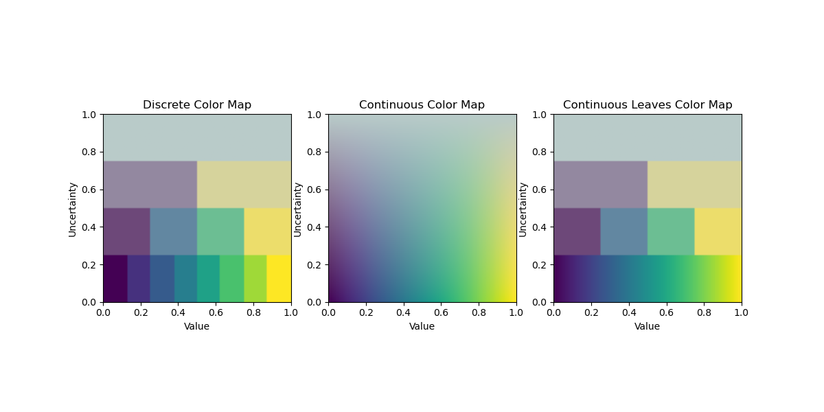
Example script demonstrating the ColorTree colormap for visualizing value and uncertainty. A ColorTree is inspired by VSUP (Value-Suppressing Uncertainty Palettes) and creates a tree-based colormap. Value is suppressed based on uncertainty, allowing for more effective visualization of uncertain data.

VSUP:https://medium.com/@uwdata/value-suppressing-uncertainty-palettes-426130122ce9

This script creates a sample 2D image where the x-axis represents value (0 to 1) and the y-axis represents uncertainty (0 to 1). It generates three visualizations: - Discrete: Uses tree nodes for discrete levels. - Continuous: Interpolates colormap colors with uncertainty. - Continuous Leaves: Uses colormap for leaf levels in discrete mode.

Run this script to see the differences between the modes.

Important necessary libraries

import numpy as np
import matplotlib.pyplot as plt
from uvisbox.Core.Colors.colortree import ColorTree

Set up the figure with three subplots

fig, ax = plt.subplots(1, 3, figsize=(12, 6))

Create a sample image where x (columns) is value (0 to 1), y (rows) is uncertainty (0 to 1)

height, width = 100, 100
value_grid = np.linspace(0, 1, width)[None, :]  # Shape (1, 100), broadcasted to (100, 100)
uncertainty_grid = np.linspace(0, 1, height)[:, None]  # Shape (100, 1), broadcasted to (100, 100)

# Create image array with shape (100, 100, 2) where last dim is [uncertainty, value]
image = np.stack([uncertainty_grid * np.ones((height, width)), value_grid * np.ones((height, width))], axis=-1)
# Initialize ColorTree with depth=4 and default settings
colormap = ColorTree(depth=4, cmap="viridis")
# Generate colors for discrete mode (uses tree nodes)
colors = colormap.get_colors(image, discrete=True)

# Plot the discrete color map
ax[0].imshow(colors, origin='lower', extent=(0, 1, 0, 1))
ax[0].set_title("Discrete Color Map")
ax[0].set_xlabel("Value")
ax[0].set_ylabel("Uncertainty")
# Generate colors for continuous mode (interpolates colormap with uncertainty)
continuous_color = colormap.get_colors(image, discrete=False)

# Plot the continuous color map
ax[1].imshow(continuous_color, origin='lower', extent=(0, 1, 0, 1))
ax[1].set_title("Continuous Color Map")
ax[1].set_xlabel("Value")
ax[1].set_ylabel("Uncertainty")

# Generate colors for continuous leaves mode (discrete with colormap at leaves)
continuous_leaves_color = colormap.get_colors(image, discrete=True, continuous_leaves=True)
# Plot the continuous leaves color map
ax[2].imshow(continuous_leaves_color, origin='lower', extent=(0, 1, 0, 1))
ax[2].set_title("Continuous Leaves Color Map")
ax[2].set_xlabel("Value")
ax[2].set_ylabel("Uncertainty")
# Display the plot
plt.show()
ColorTree Example